







Tips for Choosing Calm Colors to Transform Your Home
Creating a serene and relaxing environment in your home often starts with the colors you choose for your walls and décor. Calm colors can have a soothing effect, helping to reduce stress and promote tranquility. If you’re planning to refresh your living space, learning how to pick the right calm colors is key. This guide offers helpful tips to choose colors that encourage peace and comfort in every room.
Why Choose Calm Colors?
Colors influence mood and energy. While bright, bold colors energize and excite, calm colors create balance and softness. Using calm colors in your home can:
– Promote relaxation and restful sleep
– Make spaces feel larger and more open
– Provide a neutral backdrop for various design styles
– Enhance focus and mental clarity
Typical calm colors include soft blues, gentle greens, warm neutrals, and muted pastels. These shades are gentle on the eyes and tend to blend well with natural light.
Tips for Choosing Calm Colors for Your Home
1. Consider the Room’s Purpose
Start by thinking about how you use each room. Different calm colors work better depending on the activity:
– Bedroom: Soft blues, lavender, or pale greens encourage rest and relaxation.
– Living Room: Warm neutrals or muted earth tones create a welcoming, cozy space.
– Home Office: Light greens and soft grays help keep you focused without feeling sterile.
– Bathroom: Cool blues and seafoam greens evoke freshness and cleanliness.
Matching the color to the room’s function helps enhance the mood you want.
2. Test Colors in Natural Light
Lighting changes how colors appear. Always test paint samples at different times of the day to see how the color reacts to natural and artificial light. Paint large swatches on your wall and observe them in morning, afternoon, and evening light. This step helps avoid surprises after painting.
3. Stick to Softer Shades and Tones
When it comes to calm colors, less saturated tones work best. Instead of bright blues or vibrant greens, choose softer versions like:
– Powder blue
– Sage green
– Blush pink
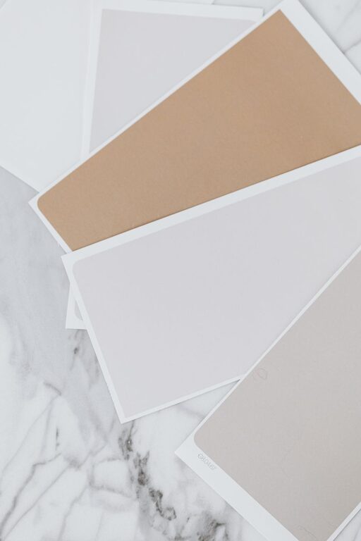
– Soft beige
– Light gray
These muted colors provide a gentle backdrop that doesn’t overwhelm your senses.
4. Use Color Combinations Wisely
Calm colors don’t have to be boring when combined thoughtfully. Create harmony by pairing:
– Two or three shades within the same color family (monochromatic scheme)
– Complementary soft tones such as light gray with blush pink or muted blue with warm beige
– Neutrals with a hint of pastel color for balance
Using color combinations can add dimension and style while preserving a peaceful vibe.
5. Think About Finish and Texture
The paint finish affects the overall feel of the space:
– Matte or eggshell finishes help colors appear softer and more natural.
– Satin or semi-gloss finishes add slight sheen but may feel brighter or more formal.
Consider textured walls, soft fabrics, and natural materials to enhance the calming effect created by your color choices.
6. Don’t Forget Accent Colors
Calm colors can be accented with subtle touches of deeper or richer hues. For example:
– A deep navy pillow on a soft blue sofa
– Forest green vases in a beige room
– Muted coral art pieces against light gray walls
Accent colors create visual interest without disrupting the calm atmosphere.
7. Use Color Psychology
Understanding basic color psychology can help you choose calm colors aligned with how you want to feel:
– Blue: Calming, promotes trust and calmness
– Green: Refreshing, symbolizes nature and balance
– Lavender: Soothing, encourages relaxation and rest
– Beige and tan: Grounding, neutral and warm
Keep in mind that personal preferences and cultural meanings vary, so select colors that feel right for you.
8. Incorporate Nature’s Palette
Nature is the ultimate source of calm colors. Draw inspiration from natural elements like:
– Ocean blues and sandy neutrals
– Forest greens and bark browns
– Soft sky grays and sunset pinks
Bringing in these colors can create a seamless, peaceful flow between indoor and outdoor spaces.
Final Thoughts
Choosing calm colors for your home is a wonderful way to create an inviting and restful space. Remember to consider the room’s function, test your choices in real light, and lean towards softer shades and harmonizing combinations. Incorporating natural textures and thoughtful accents will complete the look. With these tips, you can transform any room into a calm retreat that supports relaxation and well-being.
Ready to update your home with calm colors? Take your time choosing and enjoy the process of creating a soothing sanctuary you’ll love coming back to.